A color-coded world map titled “Frequency of dataset usage by country”. The map is a cartogram, which means that countries are distorted in size to reflect the frequency of dataset usage happening in them.

Internet Health Report

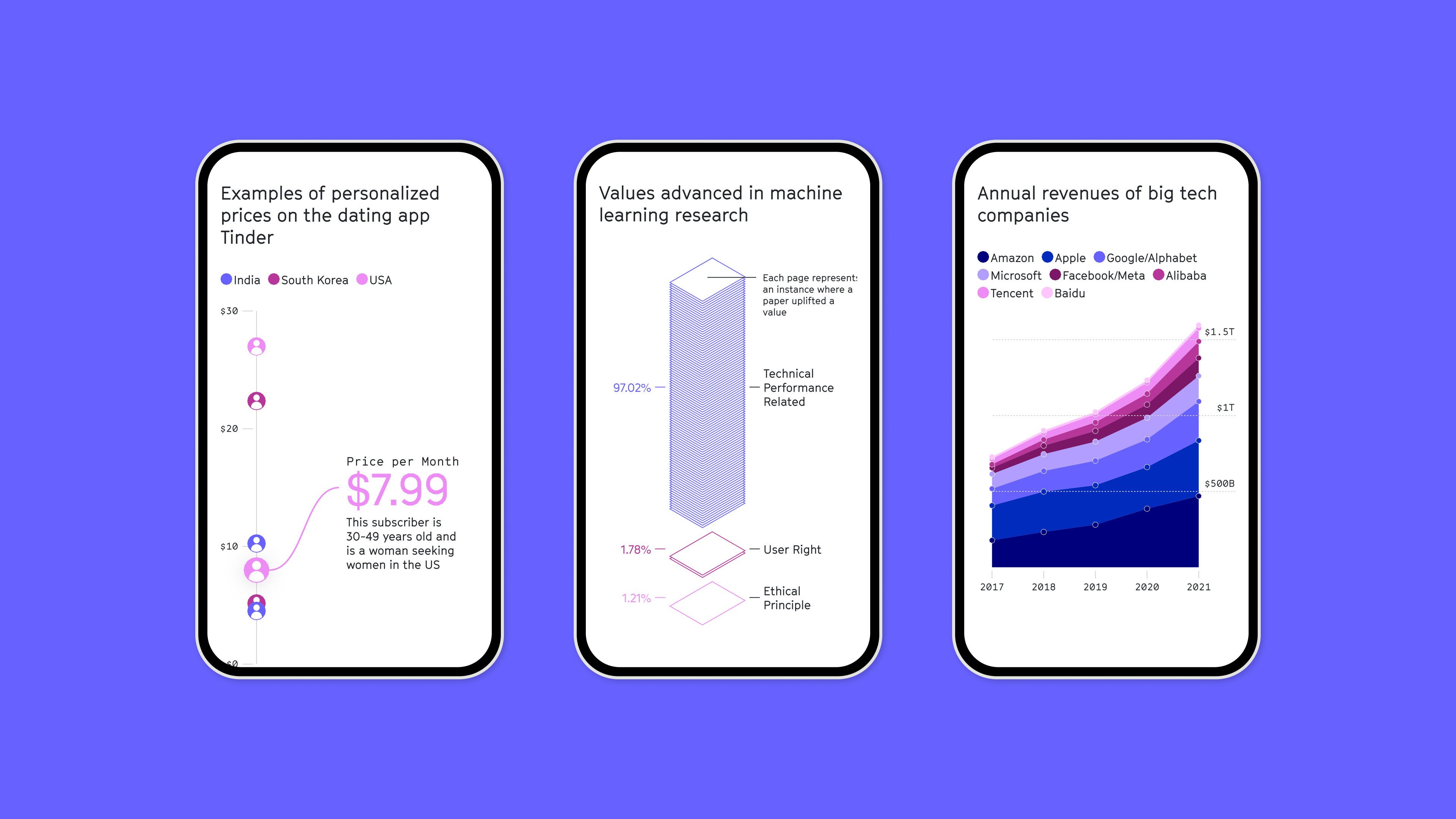
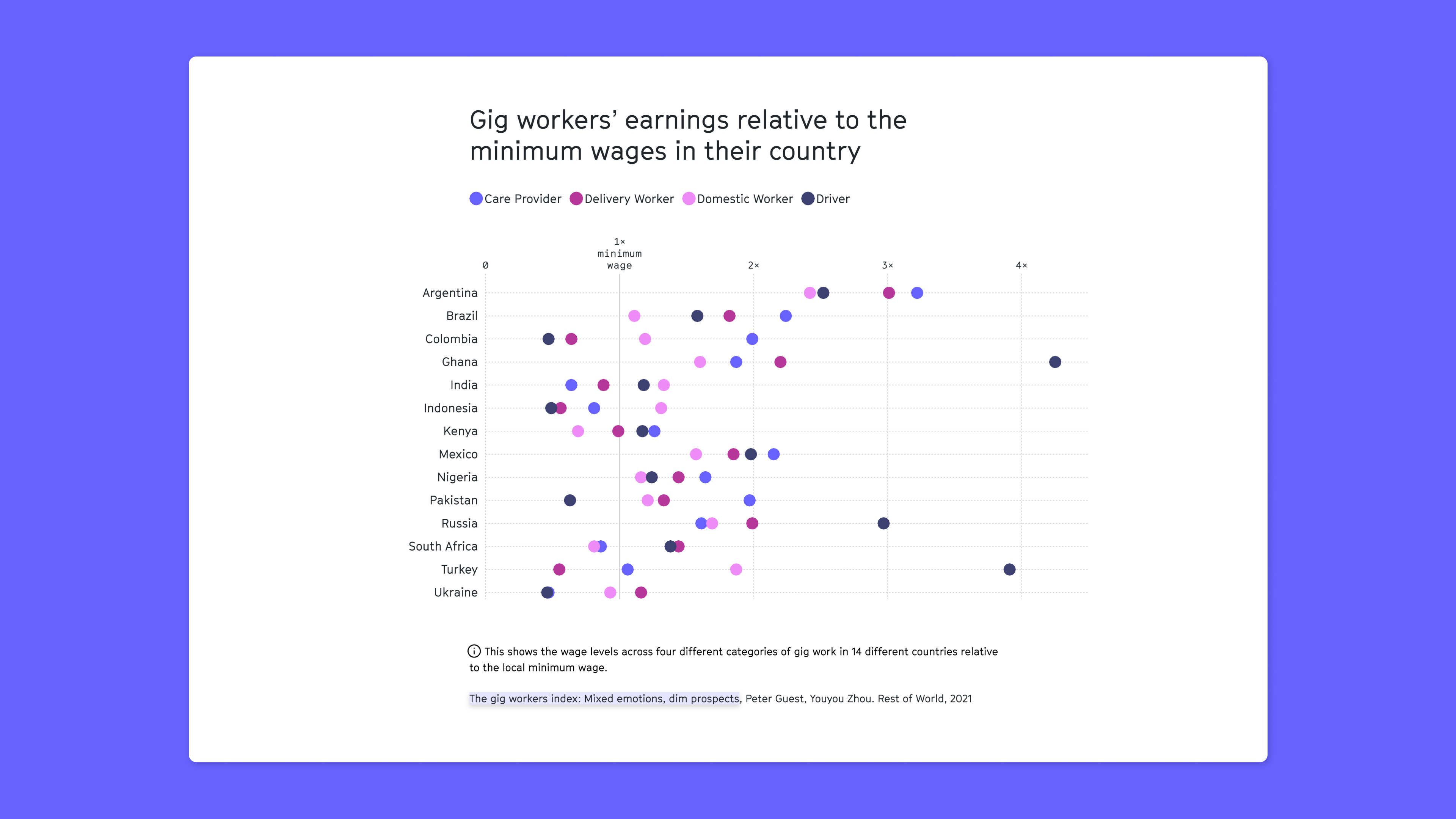
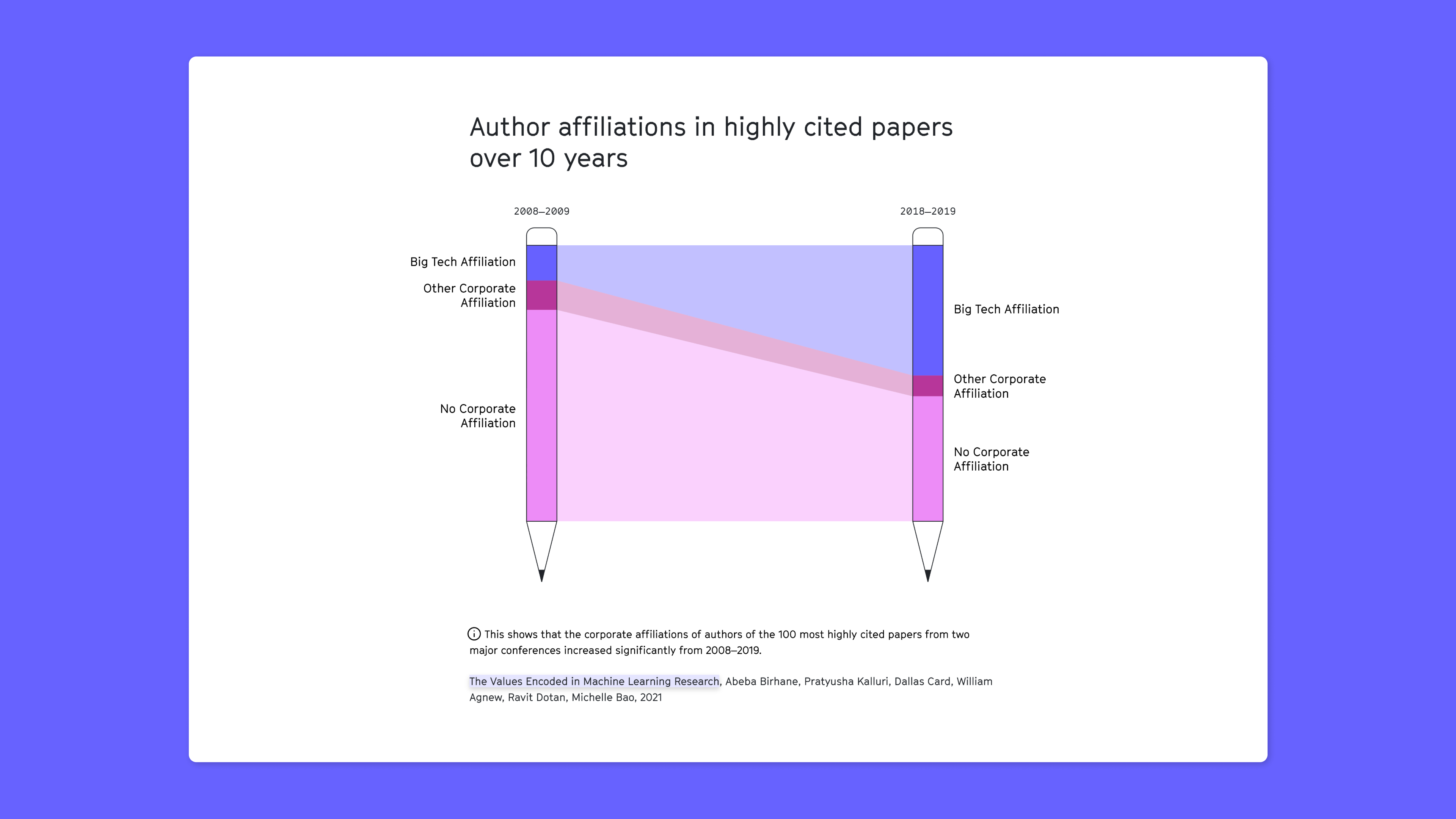
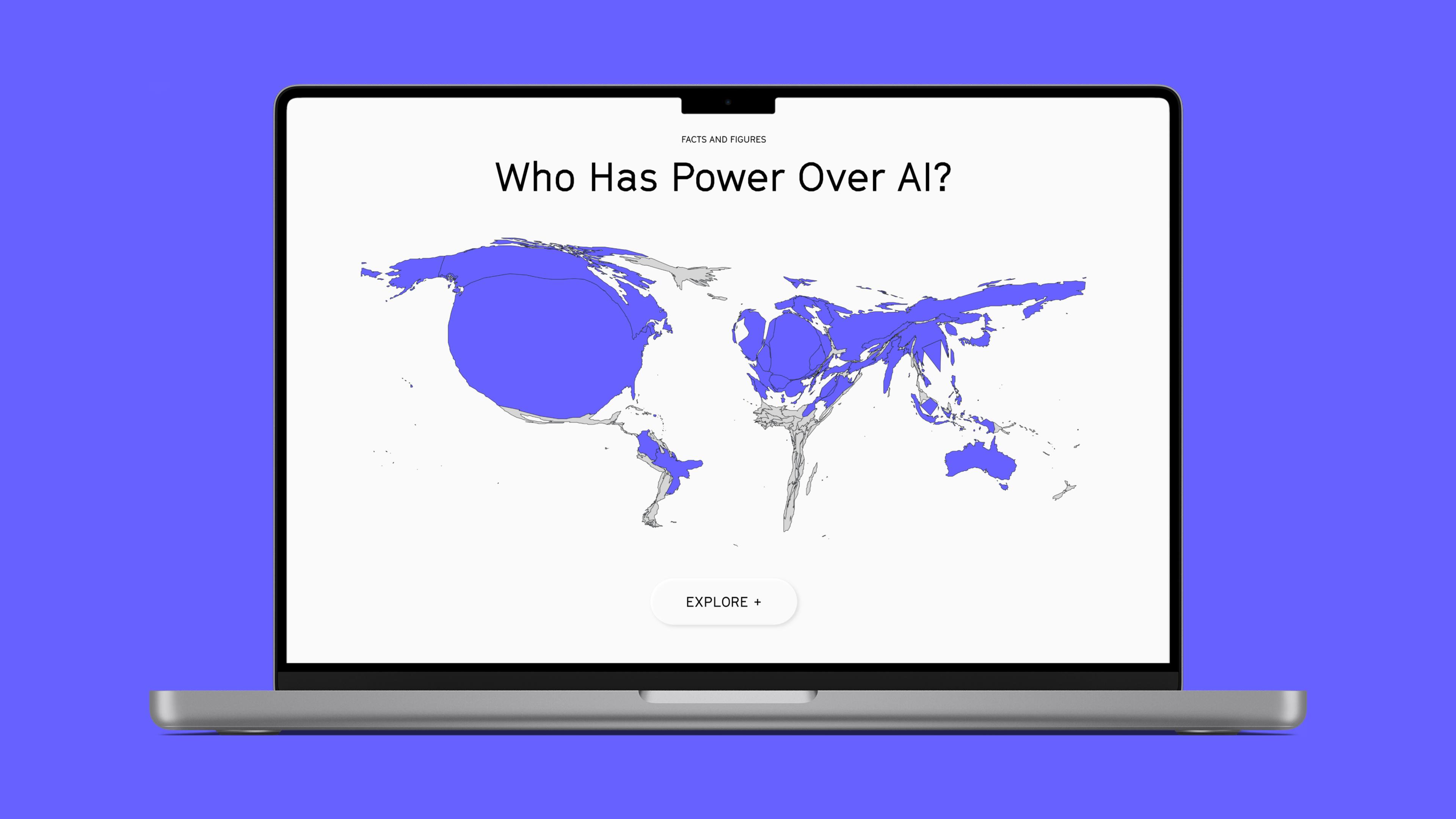
For the Mozilla Foundation's 'Internet Health Reports,' we analyzed various datasets and developed suitable visualizations through several iterations. The challenge was to ensure that the representations followed a consistent design and worked in different contexts such as stories, fact overviews, and social media. We chose a mix of unconventional and familiar styles to align with the website's modern approach.

Project features:

  • Data Visualization
  • Report
  • Design
Show AppInternet Health Report

Client:

  • Mozilla Foundation

Services:

  • Data Analysis,
  • Data Visualization,
  • Web Development
3 smartphone screens showing statistics about the personalized price of the dating app Tinder, the values advanced in machine learning and the annual revenue of big tech companies.
A graphic showing the salary of gig workers in different parts of the world, relative to their country's minimum wage.
A graphic showing that the number of big tech companies cited in author affiliations highly augmented over the last 10 years.